In today’s digital landscape, your website is the storefront, the salesperson, and often the first impression for your SaaS business. Let’s face it: a clunky, confusing, or just plain uninspiring website can kill your conversion rates faster than you can say “churn.” But what exactly separates a good SaaS website from a truly exceptional one? We’re not just talking about pretty colors and sleek animations.
It’s about clear messaging, intuitive navigation, and a laser focus on user experience. In this article, we’ll dive deep into what makes the best SaaS websites tick. We’ll dissect examples of brands that are nailing it, revealing the key design principles, conversion strategies, and compelling content that transform casual visitors into loyal customers.
Get ready to discover actionable insights you can use to elevate your own online presence and unlock unprecedented growth for your SaaS business.
Best SaaS Websites: A Look at Design and Functionality
Software as a Service (SaaS) businesses thrive on user experience. Their websites are often the first interaction a prospective customer has, so first impressions are key. A clunky or confusing site can drive potential clients away quickly.
This article spotlights some of the finest SaaS websites out there, highlighting what they do remarkably well. We’ll explore design elements, usability features, and overall strategies that contribute to their success.
By analyzing these examples, you can glean actionable insights. Improve your own SaaS website, and attract more customers with a superior online presence. Let’s dive into the details!
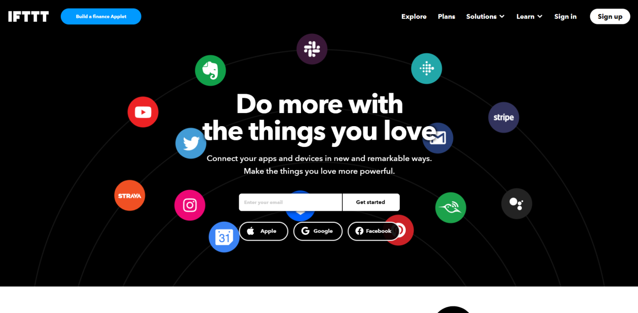
Stripe: Simplicity and Trust
Stripe’s website is a masterclass in minimalistic design. It focuses on clear messaging and building trust immediately. The clean layout emphasizes the core benefit: simplifying online payments.
The color palette is muted and professional. The typography is readable and authoritative, adding to the air of reliability. Stripe’s use of white space creates a sense of calm and order.
They smartly use testimonials from recognizable brands. This social proof reinforces their credibility and demonstrates their wide adoption. Who wouldn’t want to use what the best use?
Navigation is straightforward, guiding visitors to the information they need quickly. Pricing is transparent, removing a common barrier for potential customers. The overall experience is smooth and intuitive.
Visuals play a role, too. Animated illustrations subtly show the functionality of the platform. These elements avoid being distracting, instead adding to the story.
Slack: Playful and Engaging
Slack takes a different approach. Their website incorporates a more playful and engaging design. The use of bright colors and friendly illustrations makes the brand feel approachable and inviting. It is the epitome of collaboration and teamwork.
The copy is conversational and human, avoiding jargon and technical terms. They focus on the benefits of using Slack, such as improved communication and collaboration. The website truly feels personal.
Slack employs social proof effectively. They feature case studies and user testimonials. These demonstrate the value that Slack provides to real-world teams and organizations.
Interactive elements, like animated demonstrations, enhance the user experience. They effectively showcase how Slack works in a dynamic and memorable way. This is a smart tactic for getting their message across.
The structure of the site allows visitors to quickly grasp the problem they solve. It also helps visitors understand how they provide a solution. By showing the before and after, the consumer understands the value.
HubSpot: A Resource Powerhouse
HubSpot’s website is a content marketing machine. It’s filled with valuable resources, from blog posts and ebooks to templates and tools. They positions itself as an authority in inbound marketing.
The site is well-organized, making it easy for visitors to find what they need. The search function is prominent and effective, ensuring users can locate specific information quickly. It can get to you quickly.
Lead generation is a key focus. The site features numerous calls to action, encouraging visitors to download resources and sign up for free trials. By offering free value, it makes users interested.
HubSpot also personalizes the user experience. Content is tailored to different industries and roles, increasing engagement and relevance. Every user feels as if the website is designed specifically for them.
Their blog is updated frequently with high-quality content, keeping visitors engaged and attracting new leads. Their consistency makes the website a go-to source for information and education.
Zoom: Emphasizing Key Features
Zoom’s website prioritizes showcasing its core features. Highlighting ease of use and reliability is important. They are the factors driving its popularity in video conferencing.
The site includes video tutorials and interactive demos. These demonstrate the platform’s functionality. They show visitors how easy it is to use the platform’s key features.
Security and privacy are also emphasized. This addresses a key concern for many users of video conferencing software. Zoom wants users to feel secure when using the product.
Zoom also provides detailed pricing information, allowing potential customers to evaluate their options. This adds transparency and creates a feeling of trust.
The mobile-responsive design ensures that the website looks and functions well on all devices. Meeting the needs of their users no matter the medium is a major win.
Salesforce: Customizable Experiences
Salesforce’s website is all about customization and scale. As a comprehensive CRM platform, they cater to a wide range of businesses. They emphasize their ability to adapt to specific needs.
The site offers personalized experiences based on industry and company size. They give the user exactly what they are looking for and nothing that isn’t useful to them.
Case studies and customer stories showcase the diverse applications of Salesforce’s platform. It has become a must-have for any big business.
The site features a wealth of information about Salesforce’s various products and services. The brand makes sure that customers can find all the information they need with ease.
A strong focus on integrations with other tools and platforms highlights the platform’s flexibility. Being able to use the product with other tools the company uses makes them even more effective.